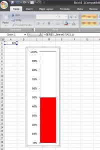
Want to know how to make thermometer chart in Excel? We’ll show you how to do this quickly and easily, so you can follow along and create your own.
How to make an Excel thermometer chart
Step 1
It’s always good to plan ahead. Before starting, determine what your chart is going to be used for — is it going to be part of a dashboard, will it stand on its own, or used as a graphic in a presentation? Taking just a few seconds to make a few considerations at the front-end will benefit you greatly at the conclusion of the project.
Step 2
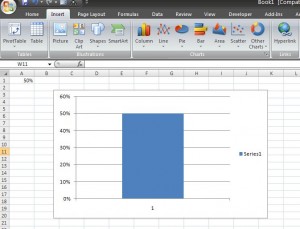
All you need is a single value in a spreadsheet, so let’s enter a 50% in cell A1 (remember, this chart is going to be designed to depict values from 0 to 100, so don’t go over that value). If you’re using a calculation that is already in your workbook (i.e., percent complete toward fundraising goal) that’s fine. You can use that, you will just need to use your cell reference in place of our A1 reference).
Step 3
With cell A1 selected go to Insert on your 2007 ribbon and select a Column chart (we’re selecting a 2-D Clustered Column). Your graph should now look like this:
Step 4
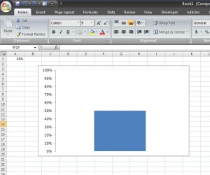
Now we’re going to clean up the chart. Select the horizontal axis (where is says “1”) by clicking one time and push delete. Do the same for “Series 1” and the vertical axis major gridlines. Just click one time on each item and choose delete. Now, left click on the vertical axis and choose Format Axis. Under Axis Options change the Maximum from Auto to Fixed and enter a 1. Then choose Ok. Your graph should look like this:
Step 5
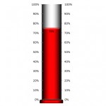
Here we’ll make the chart look like a thermometer. To do this left click the blue bar and choose Format Data Series. Under Series Options set the Gap Width to 0. Under Fill choose Solid Fill and select the color of your choice (we’re choosing red). Under Border Color, select Solid Line and choose black. Now choose close and adjust the size of your graph by making it taller and thinner. Here’s what you should have — a very basic thermometer chart.
Step 6 – Everything from here on is to make the chart look better
Make the Chart Look 3-D:
- Right click on the white portion of the chart in the plot area and choose Format Plot Area.
- Select Gradient Fill and make the following changes to the gradient stops: Stop 1 – Stop Position 0%; Color Black. Stop 2 – Stop Position 50%; Color White. Stop 3 – Stop Position 100%; Color Black. Be sure the Type is Linear and the angle is set to 180 degrees.
- Keep the Format Plot Area open and left click 1 time on the red plot area – this will open up the Format Data Series.
- Now, choose Gradient Fill and make all the same selections as above, except keep Stop 2 Color as Red.
Add a Secondary Vertical Axis:
- Click on the chart and choose Design under Chart Tools in the Ribbon.
- Click Select Data and Add a series – Click Add, leave the series name blank and put =Sheet1!$A$2, choose Ok (don’t worry if this makes the chart look funny, it’s temporary.
- Go to Layout under Chart Tools and in the top left hand corner select Series 2 (it will be in the drop down box).
- Then click Format Selection.
- Under Series Options, choose Secondary Axis within the Plot Series On section.
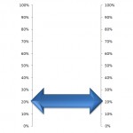
- Now we can format the Secondary Axis; right click axis and select Format Axis — make the Maximum 1 and under Number select percentage with 0 Decimal Places.
Add a base:
- Click on the chart plot area (on the white part) so that the chart size can be adjusted — adjust the size so that there is a little empty space between the end of the plot area and the bottom of the chart.
- Nex,t insert the shape of your choice, we’re going to choose Oval and draw an oval of the approximate size of your choice (note it will need to fit in the space you just created).
- Be sure to do all your formatting before you paste the object on the graph. We’re going to make it red using the Gradient Fill; Linear; Angle at 270 degrees; with 2 stops the first black the second red.
- You can also make the oval 3-D by right clicking, selecting Format Shape and going to 3-D Format — We’re choosing a Width of 2 and Height of 6.
- Once you are happy with the format (including size and shape — we suggest laying the shape over the chart to test before its permanently added).
- Select the oval, right click and select cut; then select the graph, right click and select paste (it will paste at the top).
- Move it so that it lines up nicely at the bottom.

